Building a High Dimensional Flow Cytometry Data Analysis Pipeline with Cytobank
The unsupervised nature of algorithms such as viSNE, SPADE and FlowSOM increases the chance of discovering previously undescribed phenotypes. viSNE is a dimensionality reduction and visualization algorithm that creates a two-dimensional view of high-parametric data, allowing you to identify interesting and rare biological subsets. viSNE is often used as a first step for exploratory data analysis and in Cytobank can be easily linked to clustering algorithms 1. FlowSOM is a Self Organizing Map algorithm that clusters phenotypically similar cells on the Cytobank Platform in a simple-to-interpret minimum spanning tree for fast, intuitive analysis and presentation of large high-dimensional data sets 2. Combining clustering and viSNE data and displaying clustering data on a viSNE map alongside your native data can help with clustering algorithm optimization and with the assessment of cluster identity. In the next section we provide guidance on how to perform the required steps as outlined in Figure 1.
View an example in our Technical Note, Use Machine Learning Algorithms to Explore the Potential of Your High Dimensional Flow cytometry Data Example of a 20–color Panel on CytoFLEX LX.
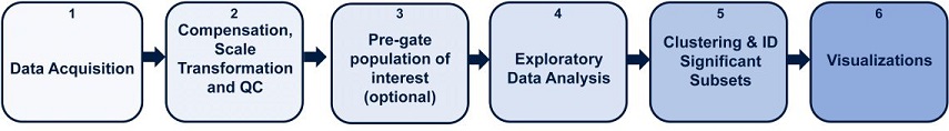
Figure 1. High Dimensional Flow Cytometry Data Analysis Pipeline with Cytobank. Key steps outlined for biomarker discovery analysis pipeline. 1) Data acquisition 2) Data compensation, transformation and quality control and 3) Data cleanup and an optional pre-gating 4) Exploratory data analysis with viSNE 5) Clustering and biomarker discovery, 6) Visualizations to communicate results.
- Data acquisition
During the experiment setup and data acquisition process, it is important to consider the sample size required for statistical validity, as well as control samples depending on your research questions. If you run your samples in multiple batches, potential batch effects also need to be assessed and controlled - Data compensation, transformation and quality control
Cytobank offers tools to prepare data for the subsequent analysis using machine learning algorithms. Alternatively, Kaluza Analysis Software and the Kaluza Cytobank plugin may be used for fluorescence compensation and data transformation.
Compensation:
Fluorescence spillover of fluorochromes into channels other than their designated detection channel is corrected by fluorescence compensation. Compensation artifacts can negatively impact downstream analysis if not corrected. Even if samples are acquired with the compensation matrix already applied, it is advisable to check and correct the compensation for all samples.
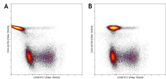
Figure 2. Cytometry Data need to be properly Compensated prior to the Advanced Machine Learning Analysis. Example of bad (A) and good compensation (B).
Scale transformation:
In flow cytometry, one of the following display scales are typically used: linear, log10, arcsinh, or biexponential transformation. Cytobank will automatically set the scale equation for fluorescent channels to arcsinh for data produced by most modern digital cytometers. It is very important to set the scales correctly for the advanced machine learning algorithms, especially the scale arguments. The algorithms will read the full range of your scale no matter if they are off scale or not, i.e. scale min and max do not matter, but the scale arguments value will affect the results. Please refer to our blog post on how to scale cytometry data.
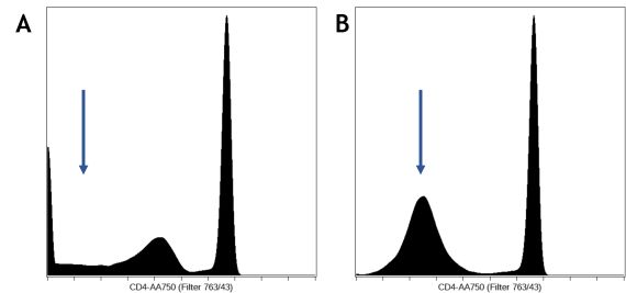
Figure 3. Scale Transformation Settings. An example of bad (A) and good scales(B). The CD4 channel was scaled improperly on the left, with a dip around the zero region, where all the negative values should form a single peak around the region, as shown on the right. - Data cleanup and an optional pre-gating
Remove unwanted events, such as from the dump channel, debris, doublets, and dead cells, by pre-gating. These events do not add information to the downstream analysis, could negatively impact data display and confound statistical results if not identified and excluded appropriately. Depending on the desired data visualization and research questions, it may be of value to pre- gate on the population of interest for further analysis.
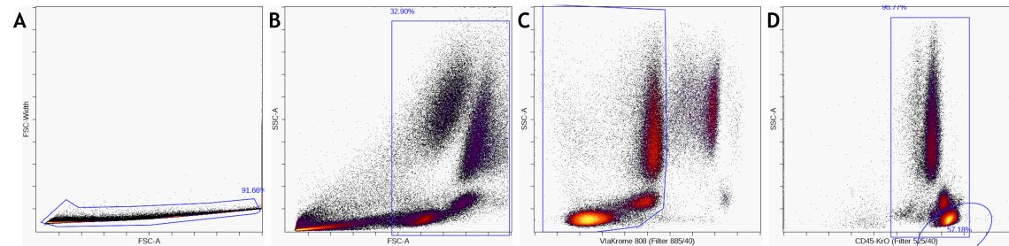
Figure 5. Data Pre-Processing by A) gate on single cells, B) gate out debris and C) gate on live cells D) gating on a major subset like CD45+ leukocytes or lymphocytes is optional. - Exploratory data analysis with viSNE How to set up a viSNE run
- Select the pre-gated population and the files for all of the samples to be analyzed. Set the total number of events to the maximum number of events for viSNE, and select equal sampling.
- Select the clustering channels to use for viSNE. You should exclude any channels used to define subsets during pre-gating, and include all channels that you want to use to define populations. Do not mix channels with linear scales and arcsinh scales in the channel selection, for example by selecting the time parameter or the scatter channels with the fluorescence channels together.
- Assess the viSNE map quality
- Amir, E. D., Davis, K. L., Tadmor, M. D., Simonds, E. F., Levine, J. H., Bendall, S. C., Shenfeld, D. K., Krishnaswamy, S., Nolan, G. P., & Pe’er, D. (2013). ViSNE enables visualization of high dimensional single-cell data and reveals phenotypic heterogeneity of leukemia. Nature Biotechnology, 31(6), 545–552. https://doi.org/10.1038/nbt.2594
- Van Gassen, S., Callebaut, B., Van Helden, M. J., Lambrecht, B. N., Demeester, P., Dhaene, T., & Saeys, Y. (2015). FlowSOM: Using self-organizing maps for visualization and interpretation of cytometry data: FlowSOM. Cytometry Part A, 87(7), 636–645. https://doi.org/10.1002/cyto.a.22625
Quality control:
The stability of the sample acquisition process can be evaluated by displaying scatter and fluorescence versus time data. Gaps in data acquisition may indicate disruptions of the sample flow by blockages or bubbles. This display allows the user to restrict the analysis to parts of the acquisition when sample flow and signal detection were stable.
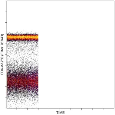
Figure 5. Data Pre-Processing by A) gate on single cells, B) gate out debris and C) gate on live cells D) gating on a major subset like CD45+ leukocytes or lymphocytes is optional.
How to interpret the viSNE results
Before you can use viSNE for any exploratory data analysis, you’ll want to check that you don’t need to fine tune any of the advanced viSNE settings. Set up a working illustration that shows the viSNE map for every file on the rows colored by every channel on the columns. Assess the viSNE map quality by examining this working illustration to make sure that it has converged well.
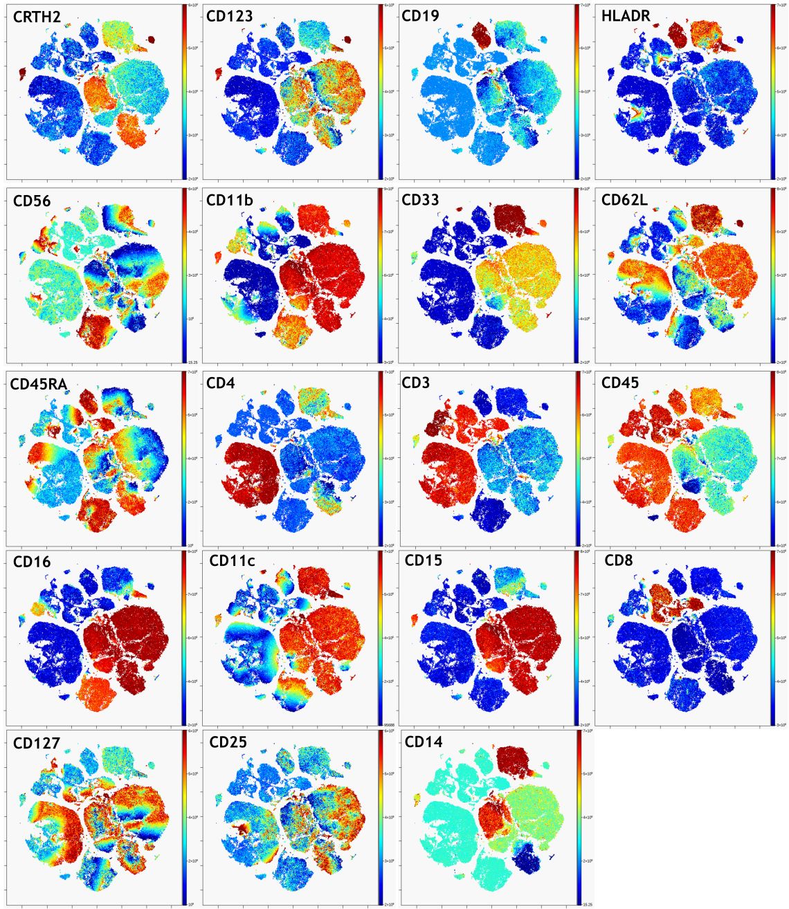
Figure 6. viSNE Visualization of 20-color Flow Cytometry Data. viSNE ran on gated live single cells, 19 markers selected as viSNE channels. viSNE setting for 100,000 events: 1000 iteration, 30 perplexity and 0.5 theta (default settings). The intensity of each marker expression, which is labeled in the top left corner of each plot, is indicated by the plot’s scale on the right.
In a nicely converged viSNE map, cells that have similar expression of clustering markers will form either separate viSNE islands (if they are very different from other cell types) or separate regions within viSNE islands. A poorly converged viSNE map will have overlapping and poorly formed islands that don’t separate the expression of a single marker into distinct locations on the map (Figure 7A). Cells expressing a given marker may appear in a string-like or spindly pattern. If the viSNE map is poorly converged, you should rerun viSNE with additional iterations (Figure 7B). viSNE maps can also be converged with the islands not very well separated. In this case, you should rerun viSNE with higher perplexity (Figure 7C). Rerun viSNE if needed, adjusting the settings based on your findings.
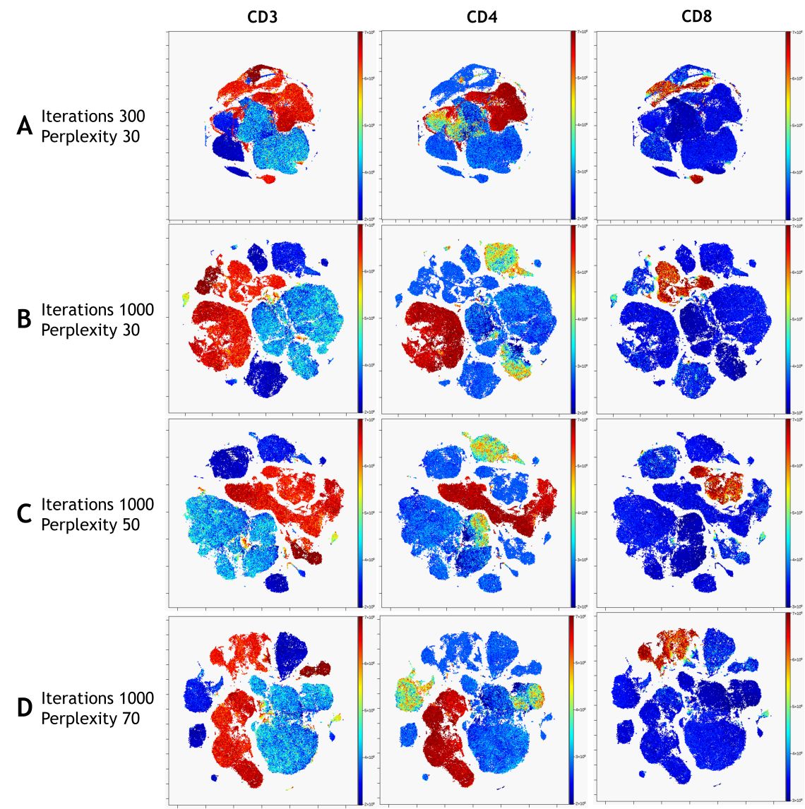
Figure 7. viSNE Visualization of 20-color Flow Cytometry Data. viSNE ran on gated live single cells, 19 markers selected as viSNE channels. viSNE settings were chosen as indicated. The intensity of each marker expression, which is labeled on the top of each plot, is indicated by the plot’s scale on the right.
For Research Use Only. Not for use in diagnostic procedures.
References
